WordPress is a popular content management system (CMS) suitable for different websites, including blogs and online stores. However, building a site from scratch with WordPress can be tricky due to unlimited customization possibilities.
For your inspiration, this article will explore over 30 best WordPress website examples. We will look into seven popular categories, such as blog, eCommerce, and business.
To make this list, our experts have evaluated websites based on the following factors:
- Design – the site’s visual appearance, including its color scheme, layout, images, and typography.
- Usability – refers to the ease of use and navigation. It relates to the location and size of buttons, navigation elements, and text.
- Responsiveness – a great website should work well on any screen size.
- Speed – the time it takes for a site to load. Optimizing images and using well-coded WordPress themes and plugins can improve it.
Business WordPress Website Examples
Excellent business websites must look professional and attractive to customers to drive more sales. In this section, we will explore the five best business WordPress example sites.
1. Airstream
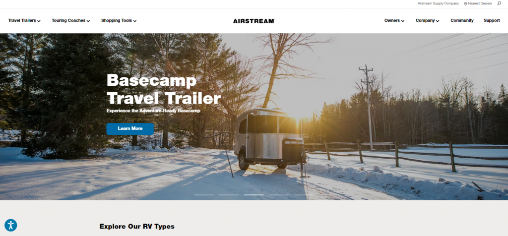
Airstream is a vehicle manufacturer focusing on travel trailers. This company’s website uses a minimalist design, with the product image occupying most of the landing pages.
This combination lets visitors immediately focus on their product. The large text and call-to-action (CTA) button accompanying the images also help visitors quickly understand Airstream’s business.
2. Sony Music

Sony Music’s website prioritizes functionality and branding. It keeps the design straightforward and uses a black, white, and red color scheme to match the company’s logo.
Its homepage features several logos and notable artists under the Sony Music Label. This helps the company establish its prowess and credibility in the music industry.
3. Tonal
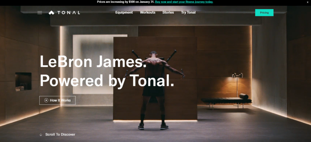
Another business WordPress example site on the list, Tonal is a smart home gym equipment company targeting athletes and sports enthusiasts. The website uses a minimalist and sophisticated design to match its high-tech product.
An interesting aspect of the website is the use of videos to showcase the product. It also features the brand ambassador and media reviews on the front page to build the company’s reputation.
4. TeamViewer

TeamViewer is a great example of a professional online business website. All elements on its landing page are informative and helpful, enticing visitors to purchase the product.
The page includes a contact number, a talk-to-sales button, and a live chat window on the landing page. In addition, the homepage features user reviews from notable platforms such as TrustPilot to improve trust.
5. aThemes
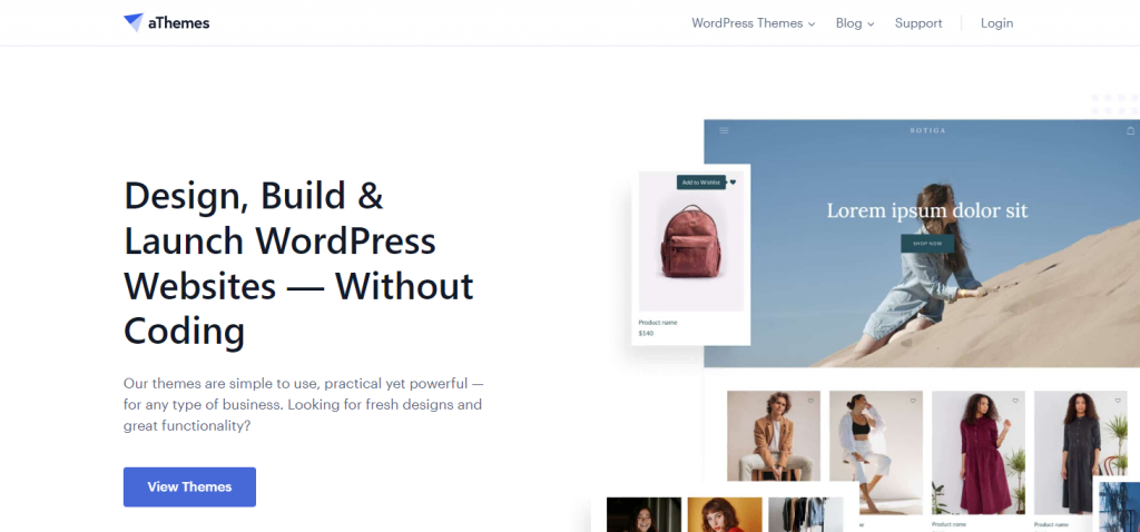
Excellent business WordPress websites must deliver clear value propositions. Visitors will be more interested in your business if they immediately know how your product or service can benefit them.
An example of such a business website is aThemes. This WordPress theme development company uses large text to explain its product’s benefits and accompanies it with a CTA button to improve its conversion rate.
eCommerce WordPress Website Examples
WordPress plugins can turn a simple already-existing site into a full-fledged online store. This section will explore eCommerce WordPress websites with the best design and shopping experience.
1. Wakami
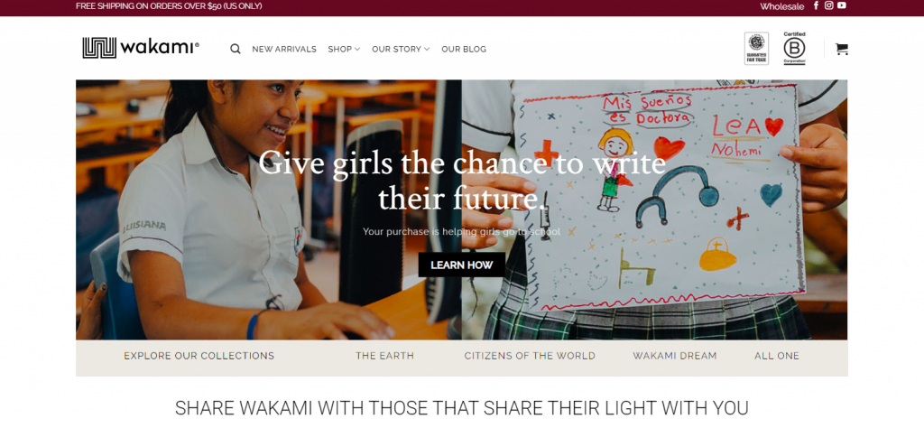
Wakami, a traditional bracelet store, is a great example of an eCommerce website with strong social brand values. This is important as visitors are more likely to buy a product from a brand that has the same values.
Its homepage uses sliding images to feature the product and messages about women’s empowerment. It also includes the prices to let visitors quickly determine if the products are within their budget.
2. Asheville Bee Charmer
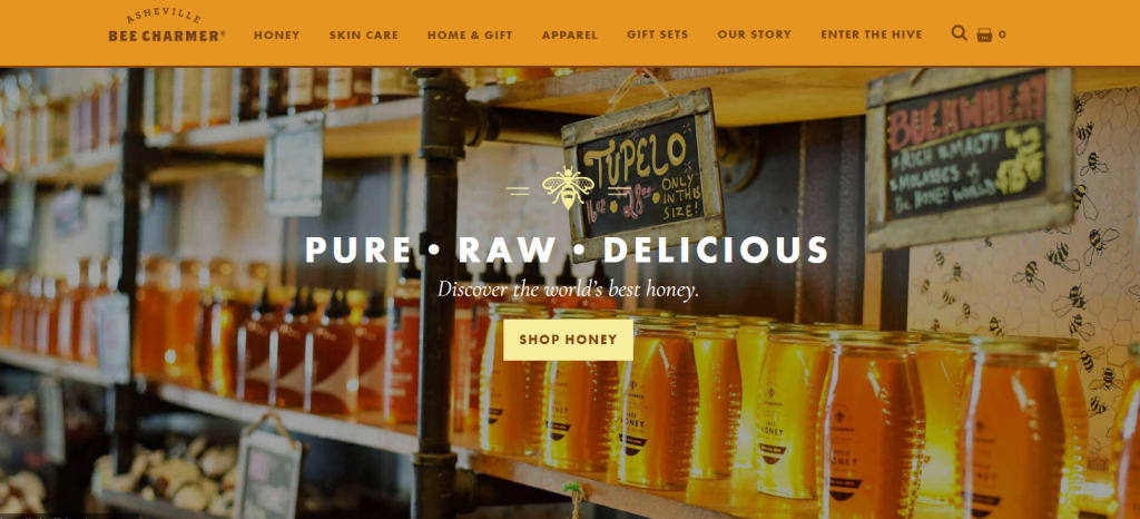
Asheville Bee Charmer’s online store sells honey-based products, including skincare and candles. This website uses a custom WordPress theme with an orange-dominant color scheme.
This eCommerce website’s navigation menu presents all product categories on the homepage. It helps visitors quickly find what to buy, which is especially useful since Ashville Bee Charmer sells many various products.
3. Shop Catalog
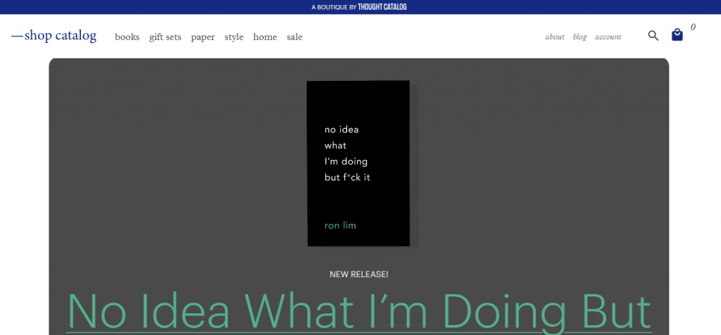
The online boutique Shop Catalog sells goods like books, clothes, and aromatic candles. Its simple design helps minimize clutter, enabling users to easily navigate the website.
It offers a single-page checkout page to help users easily review their purchases. This creates a pleasant shopping experience, making it a great WordPress website example.
4. Nalgene
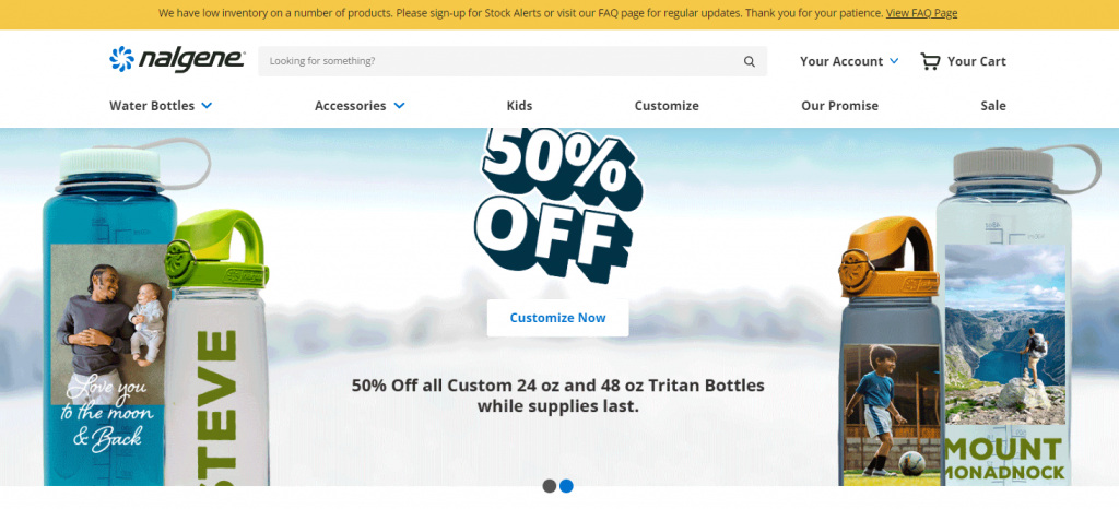
Nalgene is a great WordPress website example that features its promotions on the homepage to improve sales.
Its landing page’s banner shows current limited-time offers and includes CTA buttons. These elements create a sense of urgency, enticing visitors to purchase immediately.
5. Art & Hue
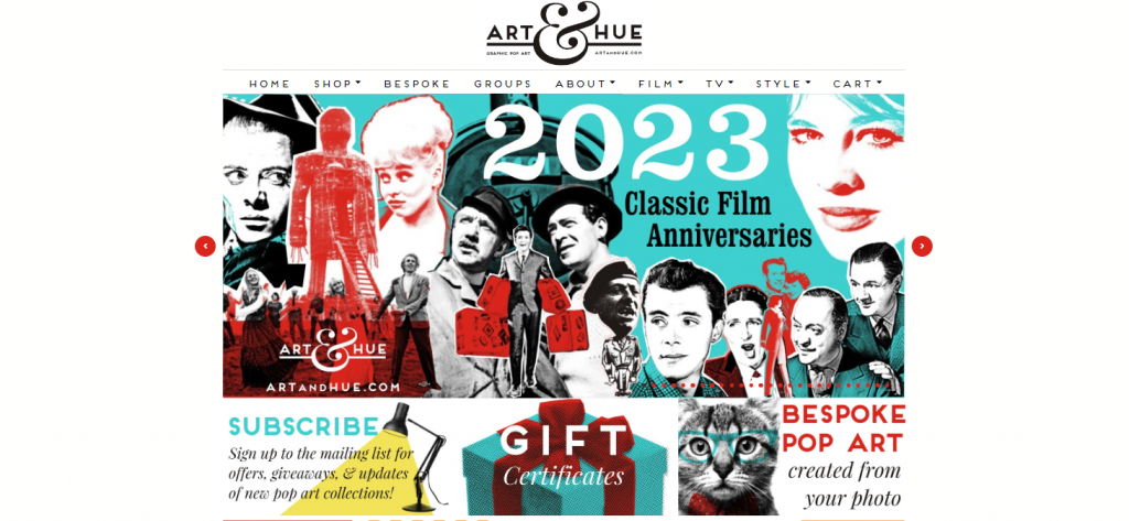
Instead of a popular minimalist look, the online pop art store Art & Hue opts for an extravagant design. Throughout the website, it uses a combination of various bright colors and typography that stands out.
Additionally, Art & Hue utilizes a plain white backdrop to highlight its products. An interesting aspect of this website is the product page, which includes the art piece’s history to give more context.
Blog WordPress Website Examples
WordPress is a popular platform for bloggers since its Gutenberg block editor is easy to learn and helps site owners create content more efficiently.
Without further ado, let’s go over the five best blog WordPress site examples.
1. Microsoft Blog
Companies create blogs for different purposes, from updating customers with the latest news and strengthening brand awareness to increasing traffic.
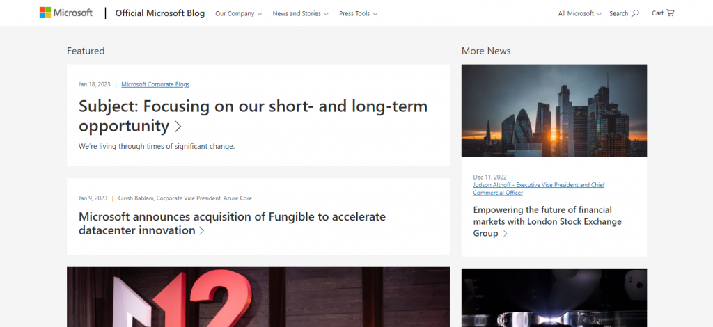
For example, Microsoft Blog’s official site provides audiences with customer stories, community blogs, press releases, and new feature updates.
It uses a multi-column layout to feature different posts on the homepage. The featured post’s column is also bigger to make it stand out.
2. Austin Kleon
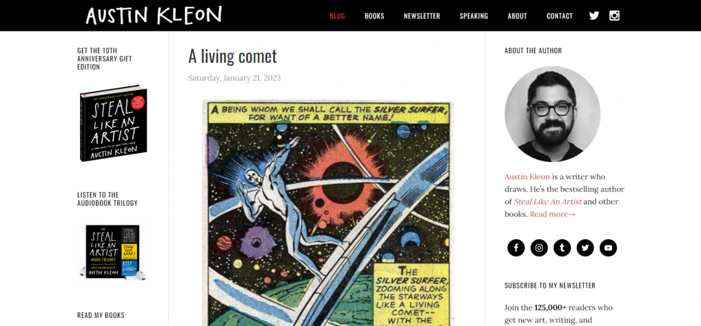
Austin Kleon’s website is a great inspiration if you want to start your own blog. This top-selling book author shares his opinion on various topics, from public speaking to office hours, and promotes his books.
Since this WordPress site example doesn’t have post categories, it presents all the blog entries on a single page. Visitors only need to scroll down and click the next pages to view older posts, keeping the navigation simple. In addition, there is a search button to help find a certain post.
3. Pinch of Yum
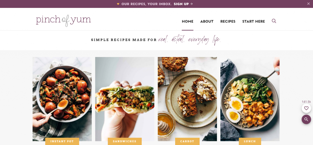
The food blog Pinch of Yum provides simple and tasty recipes for home cooks. Since this blog has many entries, it uses a design that helps visitors easily navigate the website.
An interesting feature of the website is its advanced search bar. In addition to entering keywords, visitors can explore different recipes featured in the search box.
4. The Sartorialist
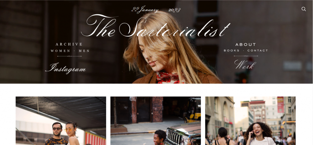
If you want to create a minimal blog site with many images, consider The Sartorialist as an inspiration. This blog’s posts use visual aids to convey the relationship between fashion and daily life.
It only uses text for post titles, category tags, and navigation buttons. While this design may not suit most blogs, it works well for fashion, photography, or art WordPress sites.
5. MyFitnessPal Blog
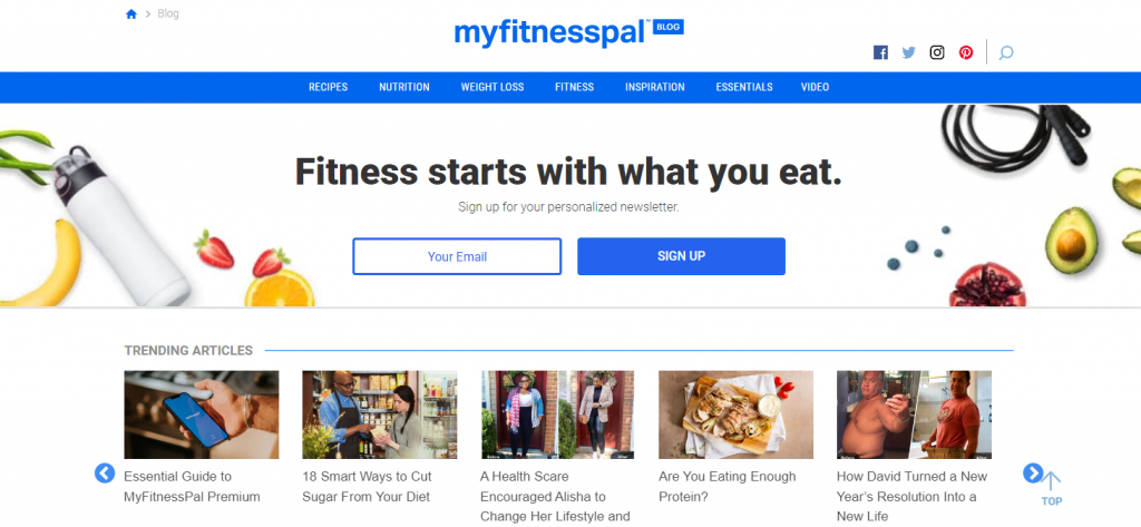
MyFitnessPal blog’s content includes healthy food recipes, weight loss guides, and fitness inspiration stories. This website uses a straightforward design to help balance visuals and usability.
Its homepage has a slider featuring trending articles and clear CTA buttons for newsletter subscriptions. This is an excellent way to attract readers and build your audience mailing list.
Membership WordPress Website Examples
Membership websites contain paywall-locked content exclusive to subscribers or members. Here are five membership WordPress site examples that implement this function well.
1. Mark Manson
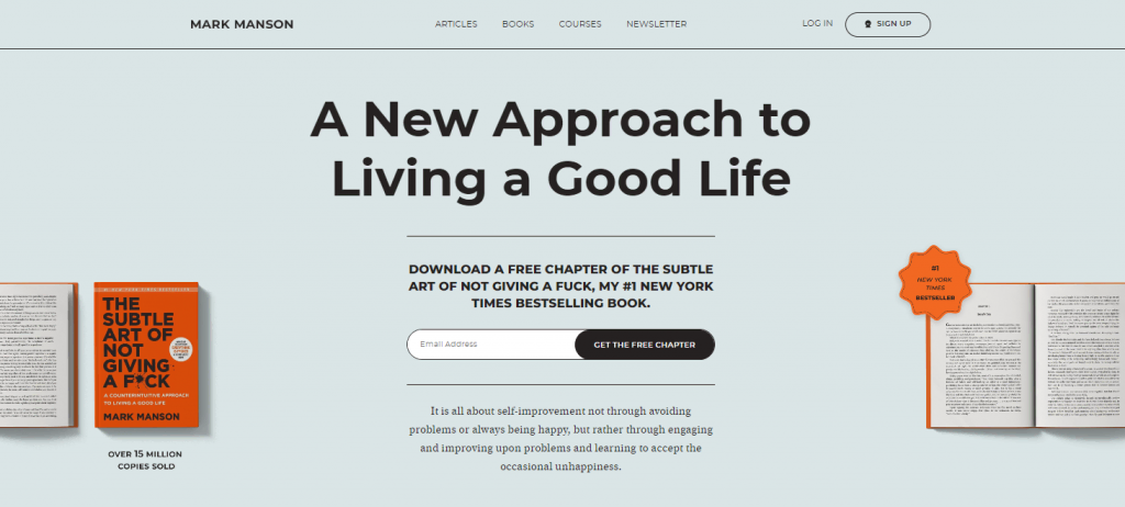
The top-selling book author Mark Monson shares personal development advice on his membership website. It provides various courses visitors can access by signing up and subscribing to the website.
To entice people to sign up, Mark Manson offers a free chapter of his book. Thanks to the lead magnet and CTA buttons’ placement on the homepage, visitors can see the offer immediately after landing on the website.
2. Quotes Cover
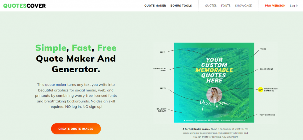
WordPress sites can attract visitors by showing memorable quotes. This is where Quotes Cover comes into play, providing users with an online tool for generating and designing captions for social media posts.
Its homepage shows a clear example of this feature and a bright CTA button, enticing you to click.
The website uses a paywall to restrict the tool’s additional functionalities. Non-registered visitors can still use it but with ads and fewer features.
3. Pilatesology

Pilatesology provides home workout classes from professional instructors. This WordPress website example offers plenty of downloadable instruction videos and a membership community exclusive to its subscribers.
Upon landing on the website, visitors can immediately see the subscription fee and the free trial CTA button. Having this information on the homepage is important for clarity since Pilatesology doesn’t offer a free plan.
4. The British History Podcast
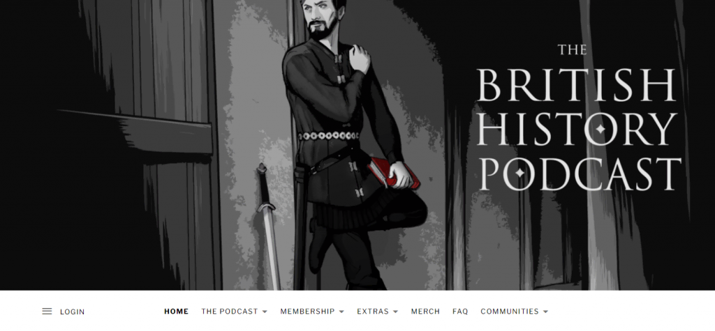
The British History Podcast retells Britain’s history in an audio format. While visitors can listen to the main show for free, the website applies the membership system to raise funds.
Members get access to exclusive episodes and transcripts. In addition, they can enjoy an ad-free listening experience. To cater to more users, it offers two subscription plans with similar benefits.
5. Healthcare Business International

As Healthcare Business International shows, membership WordPress sites can provide various exclusive content. This health industry news and networking platform offers four membership packages with different benefits.
In addition to exclusive resources, members will receive annual conference tickets, database access, and a digital interview permit. It’s not difficult to choose the most suitable option for your needs, as this WordPress site provides a table to help visitors compare the plans and their benefits.
News and Magazine WordPress Website Examples
WordPress users can create different post categories and use tags to manage their sites’ content more efficiently. These features make the CMS ideal for news and magazine sites.
1. Tech Crunch

Tech Crunch is an online media company focusing on technology and startups. Its multi-column layout website lets Tech Crunch display multiple latest news from various categories on the front page.
The website bolds the titles to catch visitors’ attention. Since there are many text elements, this website uses a simple design and color to avoid over-complicating the homepage.
2. TIME
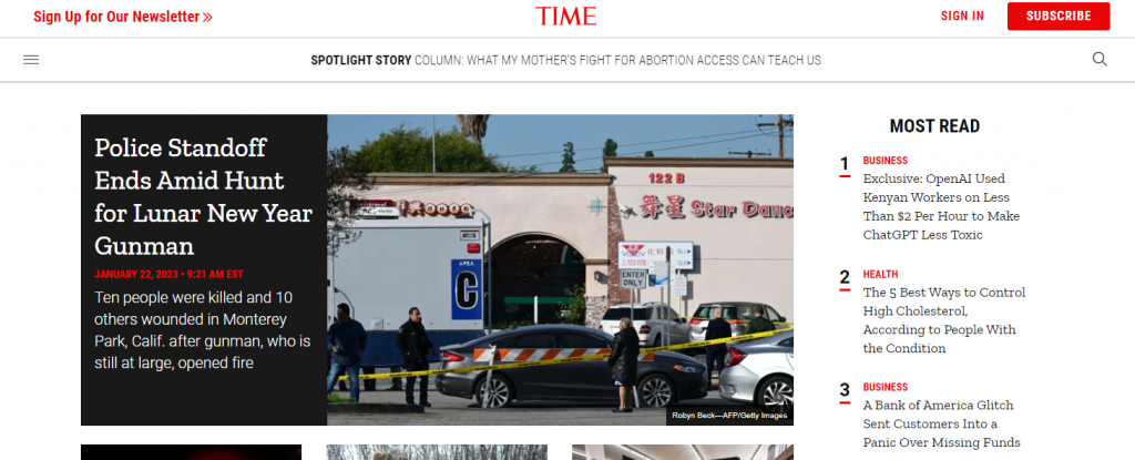
TIME keeps its site’s design and layout simple. Instead of using multiple columns, it features the articles on the front page’s Most Read and Spotlight Story sections to make them stand out.
It also includes a publish date and images in every post’s snippet to give more context. The number of images is minimal to avoid distraction and improve the site’s loading speed.
3. Vogue

As a fashion and lifestyle magazine, Vogue’s website design is straightforward and uses images as the main visual element.
This WordPress example website adopts a black and white color scheme with Vogue Avant Garde font for most of the text. This combination makes the website look modern and artistic.
4. Rolling Stone
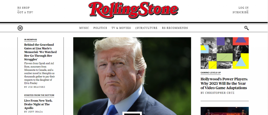
The Rolling Stone online magazine covers topics related to music videos, albums, pop culture, and politics.
This website has a strong retro theme with its color, font, and layout choice resembling an old newspaper. It has a white background and black serif typefaces to evoke feelings of history.
Instead of buttons, the site uses text for navigation elements and places them in the header to keep them easily distinguishable.
5. Crack Magazine
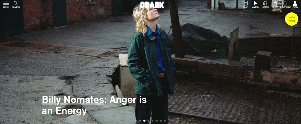
Crack is an independent online magazine on music and contemporary culture. It utilizes full-screen sliding images to show featured articles on top of the homepage and place the rest at the bottom.
Users can scroll down to see other posts presented in a multi-column layout on white background.
Agency WordPress Website Examples
Below are some top agency WordPress sites that perform and are well-designed.
1. Portent

For agencies, establishing credibility is important to attract visitors to use their services. The digital marketing agency Potent does so by featuring its specialties and past clients on the homepage.
When users scroll down, they can find detailed information about each service with a Learn More button. To keep visitors focused on important elements, Portent uses a simple website design and minimal images.
2. Nove
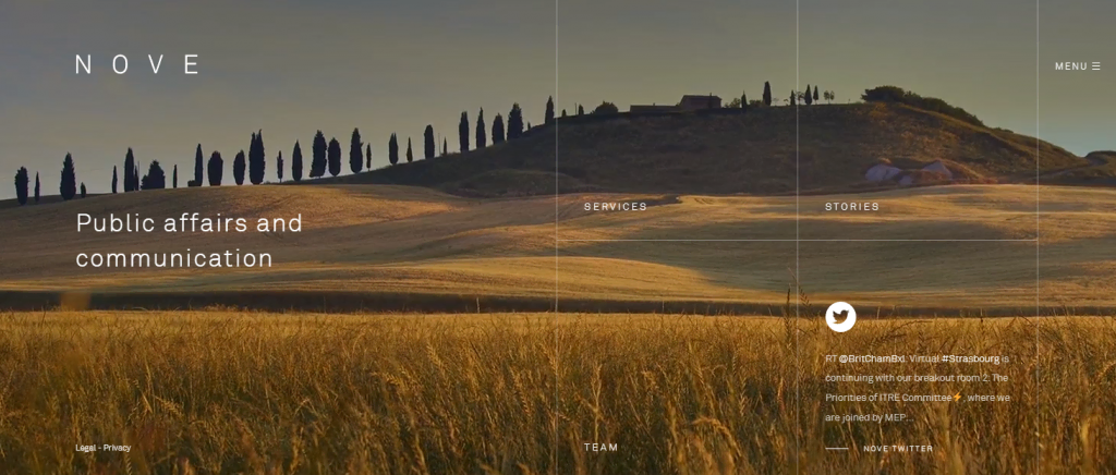
If you need inspiration for a minimalist and sophisticated website design, Nove is a great example. This advisory agency uses full-screen videos and images as its website’s background.
When it comes to website elements, such as navigation and menu buttons, they are all white. To maintain their visibility further, Nove darkens the background and utilizes simple lines for guidance.
3. Ruya

Ruya is a branding and digital marketing agency based in Dubai. It is an example of a well-designed WordPress website with great usability and user experience.
This website’s homepage features a flat-design illustration that doubles as the navigation menu. It also uses a page builder plugin to add animations like sliding and zooming in.
4. North Star Inbound

The content marketing agency North Star has a unique website visual design. It uses a starry night sky illustration background throughout the website for consistent branding and visual identity.
This website employs bright colors to let visitors easily distinguish important elements, like buttons and the cursor pointer. In addition, it offers a slider to help organize content and make the website less cluttered.
5. Bop Design

Bop Design is a B2B content marketing agency offering web design and branding services. It uses shifting colors in the background to make the straightforward website more interesting.
To highlight its past work, Bop Design utilizes two column layout to compare clients’ old and new websites. In addition, it also places the portfolio button in the navigation menu to make it easily noticeable.
Restaurant WordPress Website Examples
Restaurants typically have websites to let customers make reservations or take out orders online. Here are some great examples of restaurant WordPress sites.
1. Maple and Ash

Maple and Ash steakhouse’s website focuses on conveying the restaurant’s lavish dining experience. Its homepage features an image of the restaurant’s atmosphere and describes its redefining steakhouse experience.
This restaurant uses brown and gold for its website color scheme to create a luxurious ambiance. Its reservation and location selection buttons are also easily noticeable to improve user experience.
2. Quay
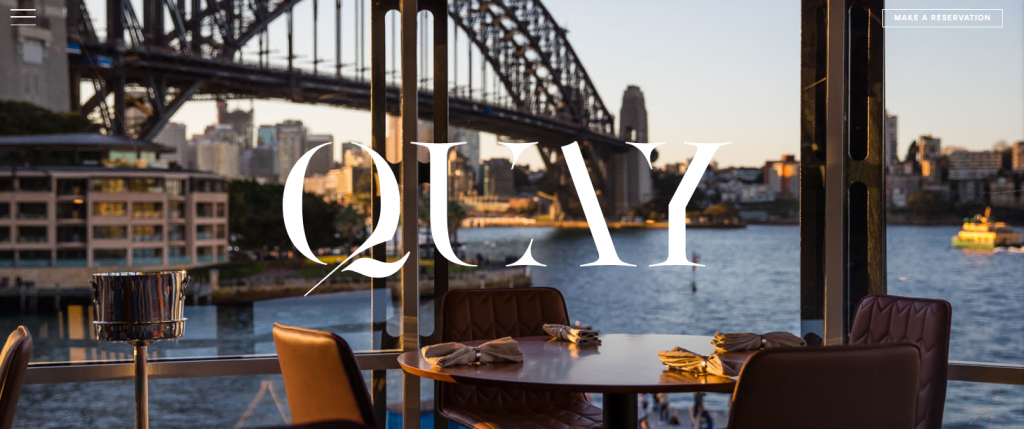
As Quay shows, a minimal and sophisticated design is suitable for a fine dining restaurant website.
Its homepage only consists of a picture, a logo, a navigation icon, and a reservation button. To reduce clutter, the website places other information on the navigation menu and underneath the homepage.
Thanks to its clear copy and icons, visitors can navigate the website easily.
3. Sushi Kimura

A restaurant can utilize the website design to reveal its cuisine. For example, Sushi Kimura has chosen a Japanese-themed design for its website.
This restaurant’s website uses Japanese calligraphy on the homepage, with picturesque images as the main visual element. It keeps the site layout minimal and provides a clear navigation menu to improve user experience.
4. Pho Cafe

Pho Cafe is a Vietnamese street food restaurant with multiple branches in the UK. Its website has a unique, playful look with custom cartoon artwork in the background and the KG Happy font.
To help fulfill visitors’ needs quickly, this website includes all the important information on the front page. For instance, it has the menu, reservation, takeaway, and location buttons for quick access.
5. Momofuku

If you want a WordPress website design that suits any restaurant type, Momofuku is a great example. This restaurant chain’s website remains visually appealing and well-usable despite the basic design.
The homepage features clickable images leading to important pages such as reservation, career, and delivery. It also has an eye-catching menu on the sidebar for easy navigation.
Why Make a WordPress Website
There are many alternatives to WordPress for building websites. For instance, you can use a website builder or another CMS like Joomla.
These platforms also let you build different websites, but using WordPress has advantages over its competitors:
- Active community – as the most popular CMS, WordPress has a large user community. As a result, there are plenty of WordPress forums where you can easily find answers to your questions.
- Customizability – WordPress has a large plugin and theme library, enabling you to create any site.
- Scalability – as it is a self-hosted platform, you can upgrade your WordPress hosting plan to accommodate more traffic.
- Fast and reliable – due to its customizability, you can speed up WordPress websites in many ways. For instance, install a caching plugin or use a minimal theme.
- SEO features – edit your .htaccess file or install an SEO plugin to help improve your site’s organic traffic. These features make WordPress ideal for small businesses.

Conclusion
WordPress is a popular platform for building any kind of website, from a simple blog to an online store. However, creating a WordPress site can be tricky due to its extensive customization options.
In this article, we have provided you with over 30 best examples of WordPress websites for your inspiration. Here are our best picks from each category:
- Business – TeamViewer, using informative and useful site elements to promote business.
- eCommerce – Nalgene, placing CTAs and limited-time offers on the homepage to help improve sales.
- Blog – Pinch of Yum, providing easy navigation and feature-rich search functionality to improve user experience.
- Membership – Mark Manson, creating ideal lead magnet placement to entice visitors to subscribe.
- News and magazine – Time, leveraging layout to feature multiple important posts without looking too complicated.
- Agency – Ruya, using animation and illustration to create a unique interactive website.
- Restaurant – Momofuku, placing large buttons and sidebar navigation to help visitors find information quickly.
We hope this article inspires you to start building your own WordPress website. If you have any questions, leave a comment below or browse our WordPress guide. Good luck!
